
Simpl Branding
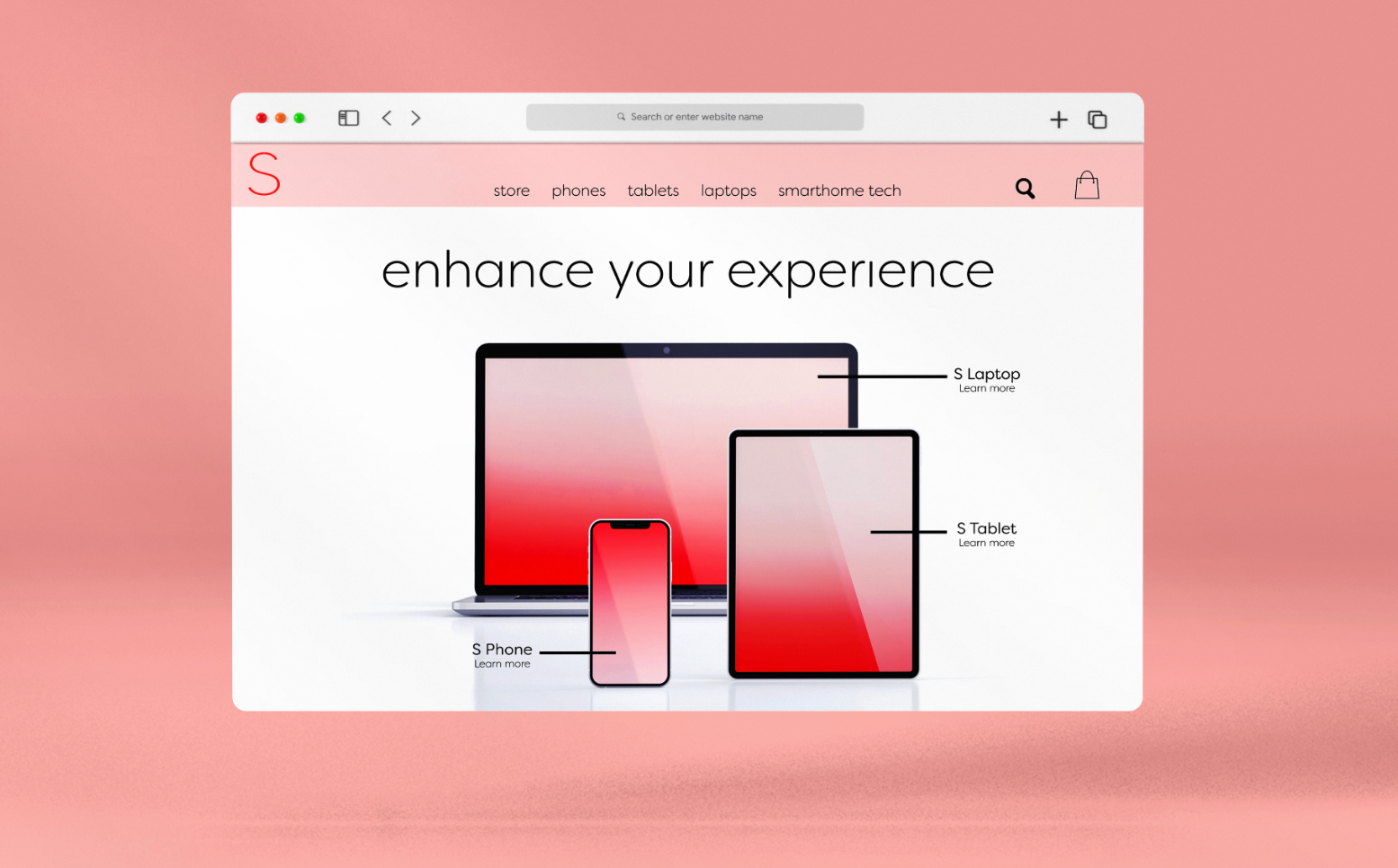
Simpl is a tech company which aims to provide simple, modern technology such as phones and computers to its consumers.
This project was done as part of my SUNY New Paltz coursework, where we were all assigned a specific branding area to tackle, and I was given technology company. My aim with this project is for this company, Simpl, to be in competition with larger companies like Apple and Microsoft, to showcase simplicity and modernity through its design choices.
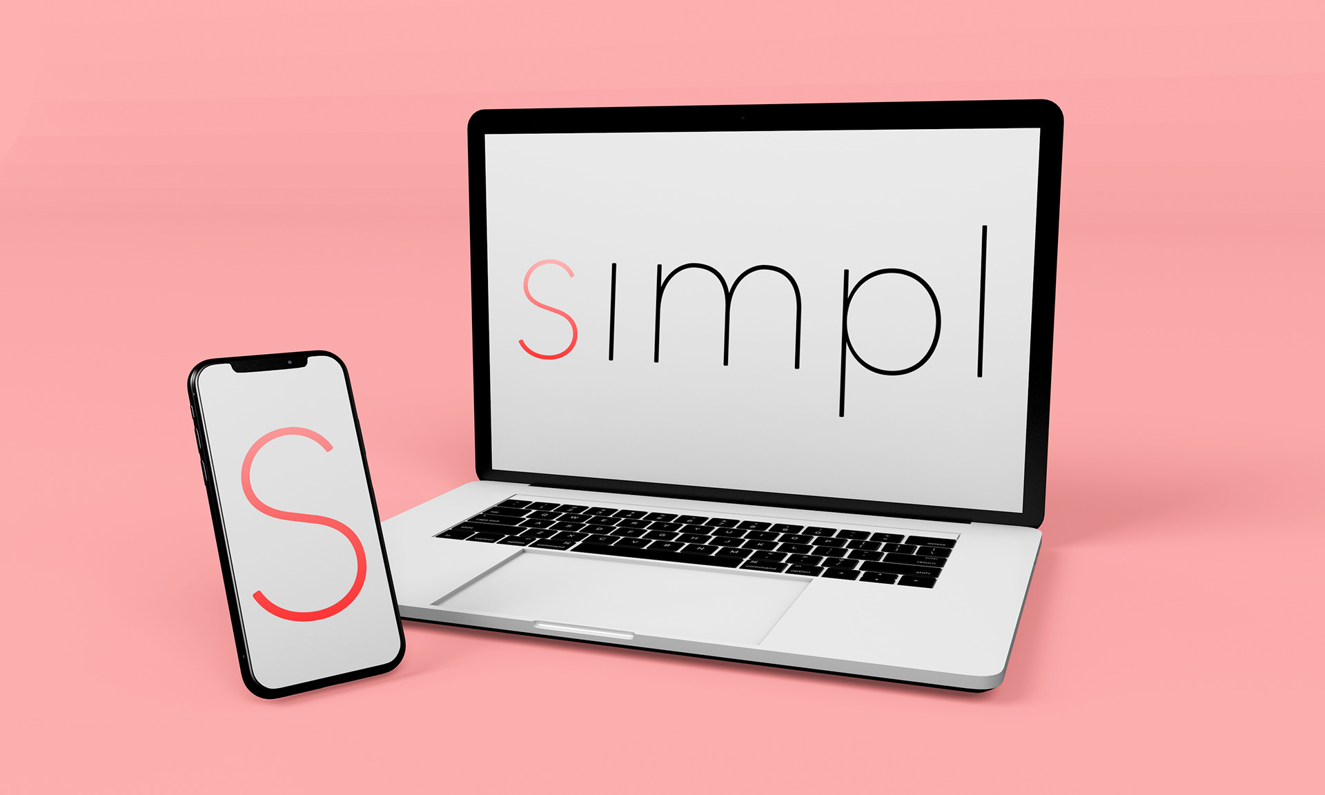
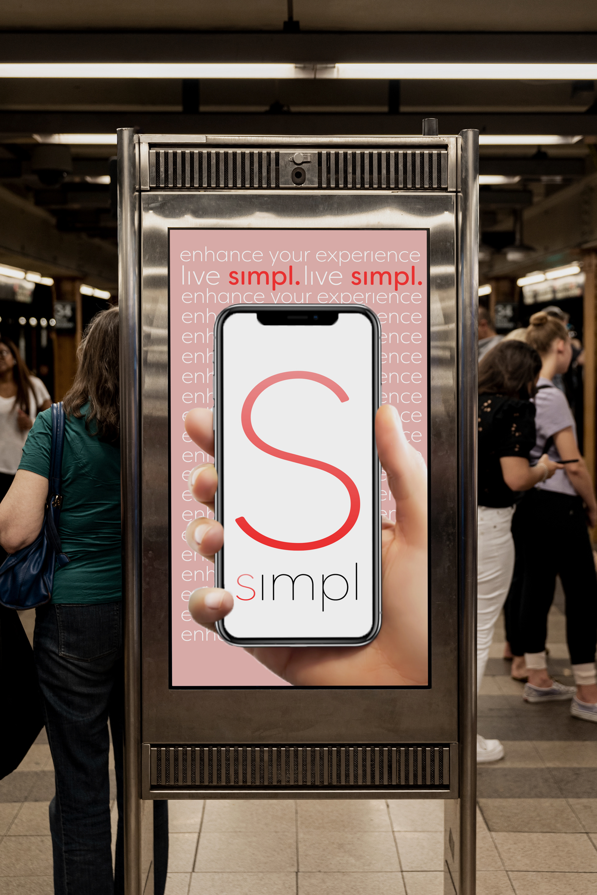
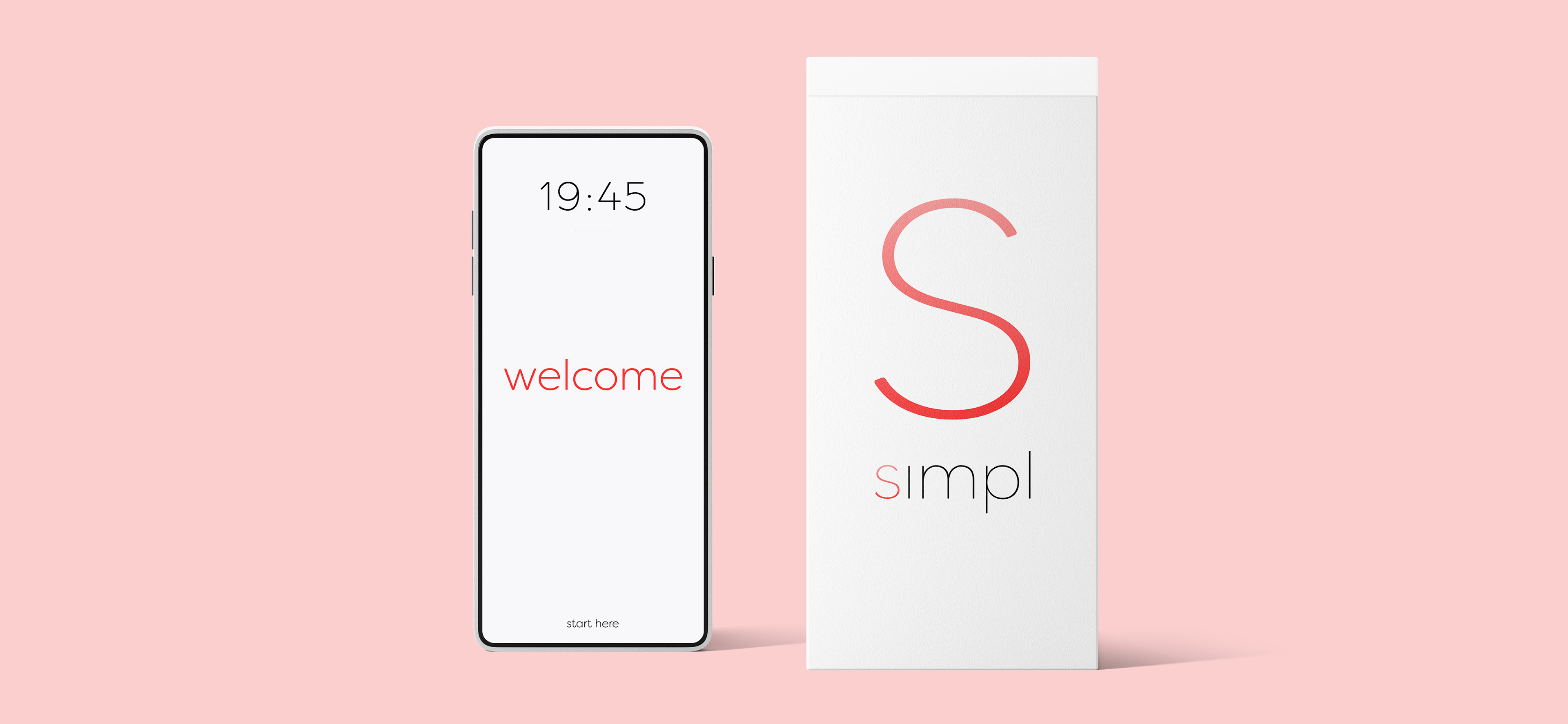
Throughout the duration of this project, I did research on what colors popular brands were using, and what colors correlate to what kinds of branding. Red was up near the top of the list, and there are not many tech companies that solely use red throughout their branding. To soften up the bold red color, I used the gradient into the pink color, using the S as the logo for the company. The wordmark and logo are very simple, naturally so, and tie into the Bauhaus ideology of not having to include something if you don't need it; so there is no e in simple, lowercase is utilized, and there is no dot on top of the i to really play into simplicity.
Client
SUNY New Paltz Coursework
Deliverables
Logo Design, Branding Guidelines